Holded.com's brand design embodies a harmonious fusion of modern sophistication, user-centricity, and approachable professionalism. The brand's visual identity is characterized by clean lines, vibrant colors, and intuitive design elements, reflecting the company’s commitment to simplicity and innovation.
Logo and Typography
Holded.com’s logo is a blend of sleek typography and a distinctive icon, symbolizing unity and growth. The chosen typeface exudes modernity and readability, ensuring a seamless user experience across various platforms. The logo's color palette, featuring a harmonious mix of bold and subtle hues, represents trust, energy, and reliability, reflecting the brand's dynamic nature.
Holded.com’s logo is a blend of sleek typography and a distinctive icon, symbolizing unity and growth. The chosen typeface exudes modernity and readability, ensuring a seamless user experience across various platforms. The logo's color palette, featuring a harmonious mix of bold and subtle hues, represents trust, energy, and reliability, reflecting the brand's dynamic nature.
Color Palette
The brand's primary color palette includes vibrant shades of blue and red, instilling a sense of trust, stability, and growth. These colors are balanced with neutral tones, like whites and grays, ensuring a professional and contemporary feel. Accent colors are strategically used to draw attention to specific elements, creating a visual hierarchy and enhancing user engagement.
The brand's primary color palette includes vibrant shades of blue and red, instilling a sense of trust, stability, and growth. These colors are balanced with neutral tones, like whites and grays, ensuring a professional and contemporary feel. Accent colors are strategically used to draw attention to specific elements, creating a visual hierarchy and enhancing user engagement.


Holded.com’s website redesign project focuses on creating an intuitive and visually appealing platform for users to effortlessly navigate and engage with the services offered. The project involves a comprehensive overhaul, integrating advanced design principles, modern technologies, and user-centered strategies:
Navigation Design and Information Architecture
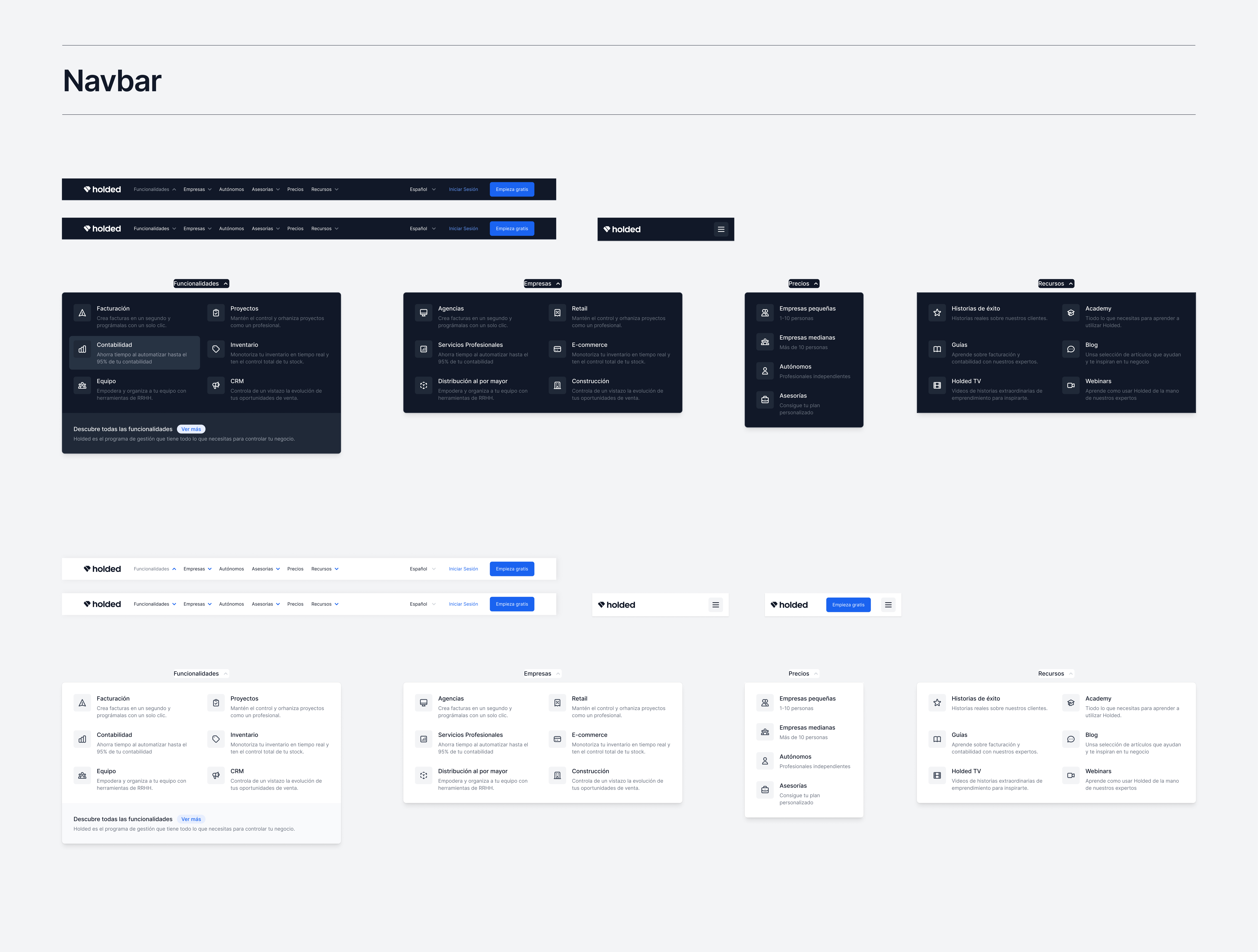
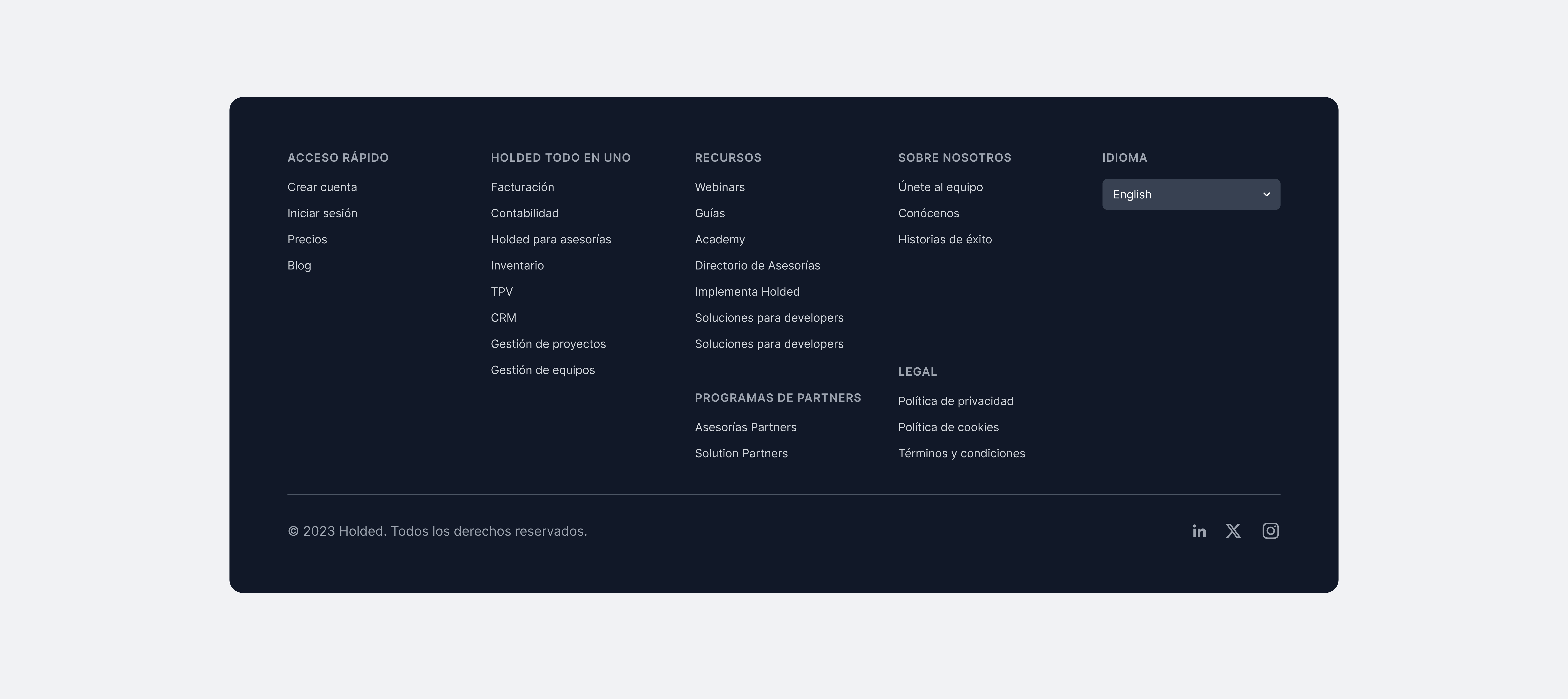
The redesign emphasizes a clear and intuitive navigation system. Through thoughtful information architecture, the website is structured to ensure easy access to product features, pricing, customer testimonials, and support resources. Intuitive menu structures and well-defined user flows guide visitors seamlessly through the site, enhancing user experience.
Design Systems and Tailwind Implementation
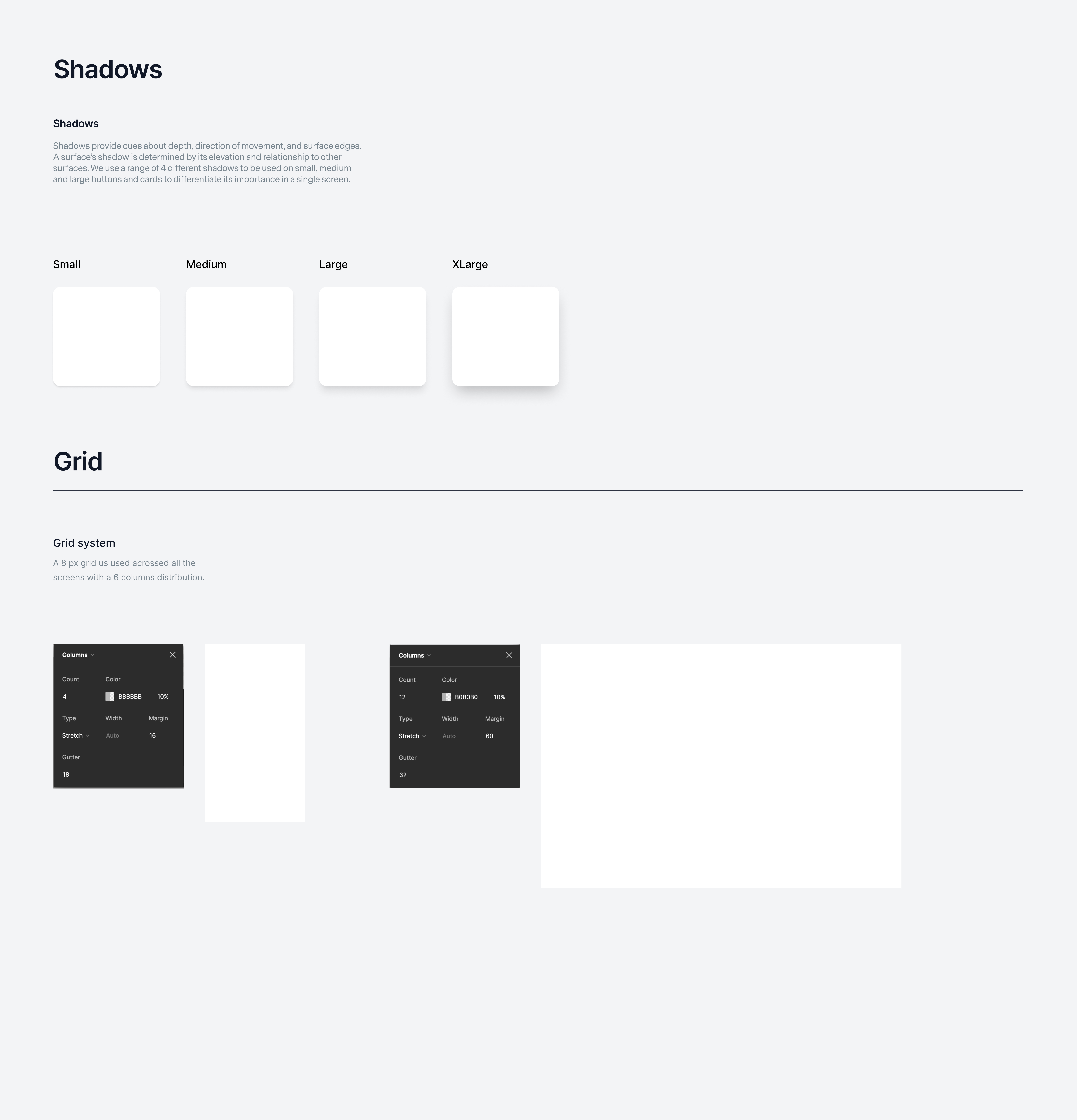
A robust design system is implemented, ensuring consistency across the website. Tailwind CSS, a utility-first CSS framework, is leveraged for rapid and efficient front-end development. This approach accelerates the design process and ensures a cohesive visual language, allowing for easy maintenance and scalability as the website evolves.
A robust design system is implemented, ensuring consistency across the website. Tailwind CSS, a utility-first CSS framework, is leveraged for rapid and efficient front-end development. This approach accelerates the design process and ensures a cohesive visual language, allowing for easy maintenance and scalability as the website evolves.
Responsive Design and High-Conversion Elements
The website design is fully responsive, adapting seamlessly to various devices and screen sizes. High-conversion elements are strategically incorporated, such as prominent call-to-action buttons, compelling headlines, and persuasive content. User engagement is optimized through interactive forms, dynamic content modules, and personalized user experiences, all designed to enhance conversion rates.
The website design is fully responsive, adapting seamlessly to various devices and screen sizes. High-conversion elements are strategically incorporated, such as prominent call-to-action buttons, compelling headlines, and persuasive content. User engagement is optimized through interactive forms, dynamic content modules, and personalized user experiences, all designed to enhance conversion rates.


